From MudBlazor to Tailwind CSS: Rebuilding Koru Recruitment's UI
A detailed look at migrating a Blazor WebAssembly app from Material Design components to utility-first Tailwind CSS - the challenges, wins, and lessons learned
When I first built Koru Recruitment, I reached for MudBlazor — it was the obvious choice. A mature component library with Material Design aesthetics, built specifically for Blazor. Within days, I had a functional recruitment platform with cards, forms, navigation, and a professional-looking interface. So why did I spend weeks migrating everything to Tailwind CSS?
This is the story of that migration: the frustrations that led to it, the challenges encountered along the way, and the surprisingly satisfying result. Whether you are considering a similar migration or just curious about the trade-offs between component libraries and utility-first CSS in the Blazor ecosystem, this post is for you.
See the results: New Tailwind Version | Original MudBlazor Version
Why MudBlazor Made Sense Initially
MudBlazor is genuinely excellent for what it does. When I started building Koru Recruitment for a government client, the component library offered immediate benefits:
- Rapid prototyping: Drop in a
<MudCard>, add some<MudTextField>inputs, wrap it in a<MudDrawer>layout, and you have a working interface in minutes - Consistent design: Material Design 2.0 out of the box — no design decisions required
- Blazor-native: Components are built for Blazor, not ported from JavaScript frameworks
- Comprehensive: Nearly every UI pattern you need is covered
The original Koru interface worked. The purple Material Design theme was recognizable and professional. The cards had proper elevation shadows. The navigation sidebar was exactly what you would expect from a Material Design application. For a minimum viable product, it was more than adequate.
But as the project evolved, cracks began to appear.
Why I Decided to Migrate
The decision to migrate was not made lightly. Rewriting an entire UI layer is expensive, time-consuming, and risky. But several factors combined to make it feel necessary.
Design Flexibility Limitations
The first issue was branding. Material Design has a distinctive look — that purple primary color, the Roboto typography, the specific shadow elevations. My client wanted something that felt more unique, more aligned with their brand identity. With MudBlazor, customizing the theme meant fighting against defaults rather than building from a blank canvas.
I found myself adding CSS overrides to strip away Material Design characteristics, which felt backwards. Why use a design system if you are spending time removing its opinions?
Dark Mode Complexity
Dark mode had become a user expectation, and while MudBlazor has dark mode support, implementing it consistently across custom components proved challenging. The theme system worked well for built-in components but required careful coordination when mixing custom markup.
Tailwind’s approach — where every component explicitly defines both light and dark variants — turned out to be more predictable. There was no guessing about whether a component would respect the theme toggle.
Responsive Design Friction
The MudBlazor approach to responsive design felt constrained. While the grid system worked, building truly responsive layouts required understanding the component library’s specific breakpoint system and working within its constraints.
I wanted a mobile-first sidebar that would collapse into a hamburger menu on smaller screens. With MudBlazor’s MudDrawer, this was possible but required specific configuration patterns. With Tailwind, it was just CSS classes with responsive prefixes — the mental model was simpler.
Bundle Size Considerations
Component libraries bring weight. MudBlazor includes JavaScript for ripple effects, overlays, dialogs, and more. While this is optimized and tree-shaken where possible, Tailwind’s utility classes are aggressively purged at build time. Any class not actually used in your codebase simply does not exist in the final CSS.
For a Blazor WebAssembly application where initial load time matters, every kilobyte counts.
Long-term Maintenance Philosophy
Perhaps the most compelling reason was philosophical. With MudBlazor, I was dependent on a third-party library’s update cycle, breaking changes, and design decisions. With Tailwind, I owned every visual aspect of the application. The CSS was mine — no abstractions, no magic, no surprises.
Migration Strategy
I evaluated two approaches: incremental migration (replacing components one by one while both systems coexisted) and a complete rebuild of the UI layer. I chose the latter.
Why a Complete Rebuild
An incremental approach would have meant maintaining two styling systems simultaneously, with potential conflicts between MudBlazor’s CSS and Tailwind’s utilities. The cognitive overhead of switching mental models between components felt higher than simply rebuilding everything with a consistent approach.
The application’s backend services, state management, and business logic remained untouched. Only the UI layer — the Razor components and their styling — needed to change.
Component Inventory
Before writing any code, I catalogued every MudBlazor component in use:
- Layout:
MudAppBar,MudDrawer,MudMainContent,MudContainer - Navigation:
MudNavMenu,MudNavLink,MudNavGroup - Content:
MudCard,MudCardContent,MudCardActions,MudText - Forms:
MudTextField,MudSelect,MudCheckbox,MudDatePicker - Feedback:
MudAlert,MudSnackbar,MudDialog - Display:
MudTable,MudBadge,MudChip,MudIcon
For each component, I documented the equivalent Tailwind approach. Some were straightforward (cards, buttons), others required more thought (data tables, date pickers).
Setting Up Tailwind in Blazor
Integrating Tailwind CSS with Blazor WebAssembly required a few configuration steps. The tailwind.config.js needed to scan Razor files for class usage:
/** @type {import('tailwindcss').Config} */
export default {
  content: [
    './**/*.razor',
    './**/*.html',
    './**/*.cshtml',
  ],
  darkMode: 'class',
  theme: {
    extend: {
      fontFamily: {
        sans: ['Inter', 'system-ui', '-apple-system', 'sans-serif'],
      },
      colors: {
        teal: {
          50: '#f0fdfa',
          100: '#ccfbf1',
          600: '#0d9488',
          700: '#0f766e',
          // ... full palette
        },
      },
    },
  },
  plugins: [],
}
The key decisions here were using darkMode: 'class' for programmatic theme control and extending the color palette with custom teal shades to establish a distinctive brand identity.
The CSS entry point (input.css) established base styles:
@import "tailwindcss";
@config "../../tailwind.config.js";

@layer base {
  html {
    font-family: 'Inter', system-ui, -apple-system, sans-serif;
    -webkit-font-smoothing: antialiased;
  }

  body {
    @apply bg-slate-50 text-slate-900 dark:bg-slate-900 dark:text-slate-100;
  }
}
Technical Implementation
The migration touched every visual component in the application. Here are the most instructive examples of how MudBlazor patterns translated to Tailwind CSS.
Card Components
The card transformation exemplifies the shift from abstracted components to explicit styling. Here is how a job posting card evolved:
MudBlazor Approach (Before):
<MudCard Elevation="2">
    <MudCardContent>
        <MudIcon Icon="@Icons.Material.Filled.Work" Color="Color.Primary" />
        <MudText Typo="Typo.h6">Job Postings</MudText>
    </MudCardContent>
    <MudCardActions>
        <MudButton Color="Color.Primary">VIEW JOBS</MudButton>
    </MudCardActions>
</MudCard>
Tailwind Approach (After):
<article class="group relative bg-white dark:bg-slate-800 rounded-xl
               border border-slate-200 dark:border-slate-700 p-6
               hover:border-teal-300 dark:hover:border-teal-700
               hover:shadow-lg hover:shadow-teal-500/5
               transition-all duration-200">

    <button type="button"
            @onclick="HandleToggleSave"
            class="@($"absolute top-4 right-4 p-2 rounded-lg transition-colors
                   {(IsSaved ? "text-amber-500 bg-amber-50 dark:bg-amber-900/20"
                             : "text-slate-400 hover:text-amber-500
                                hover:bg-slate-100 dark:hover:bg-slate-700")}")">
        @if (IsSaved)
        {
            <svg class="w-5 h-5" fill="currentColor" viewBox="0 0 24 24">
                <path d="M5 5a2 2 0 012-2h10a2 2 0 012 2v16l-7-3.5L5 21V5z"/>
            </svg>
        }
        else
        {
            <svg class="w-5 h-5" fill="none" stroke="currentColor" viewBox="0 0 24 24">
                <path stroke-linecap="round" stroke-linejoin="round" stroke-width="2"
                      d="M5 5a2 2 0 012-2h10a2 2 0 012 2v16l-7-3.5L5 21V5z"/>
            </svg>
        }
    </button>

    <span class="inline-flex px-2.5 py-1 text-xs font-medium rounded-full
                 bg-teal-50 dark:bg-teal-900/30 text-teal-700 dark:text-teal-300 mb-3">
        @Job.JobType
    </span>

    <h3 class="text-lg font-semibold text-slate-900 dark:text-white
               group-hover:text-teal-600 dark:group-hover:text-teal-400
               transition-colors mb-2">
        @Job.Title
    </h3>
</article>
The Tailwind version is more verbose, but every style decision is explicit. The group and group-hover: classes create coordinated hover effects where hovering over the card changes the title color — a pattern that required custom CSS with MudBlazor.
Form Styling
Forms were perhaps the most complex migration. MudBlazor’s form components include validation integration, floating labels, and Material Design input styling. Recreating these patterns required careful attention:
<div class="min-h-screen bg-slate-50 dark:bg-slate-900 flex flex-col">
    <main class="flex-1 flex items-center justify-center px-4 py-12">
        <div class="w-full max-w-md">
            <div class="bg-white dark:bg-slate-800 rounded-2xl
                        shadow-xl shadow-slate-200/50 dark:shadow-slate-900/50
                        border border-slate-200 dark:border-slate-700 p-8">

                <!-- Social Login Button -->
                <button type="button"
                        @onclick="OnGoogleLogin"
                        class="w-full flex items-center justify-center gap-3
                               py-3 px-4 bg-white dark:bg-slate-700
                               border border-slate-300 dark:border-slate-600
                               rounded-lg text-slate-700 dark:text-slate-300
                               font-medium hover:bg-slate-50 dark:hover:bg-slate-600
                               transition-colors">
                    <svg class="w-5 h-5" viewBox="0 0 24 24">
                        <!-- Google icon paths -->
                    </svg>
                    Continue with Google
                </button>

                <!-- Divider -->
                <div class="relative my-6">
                    <div class="absolute inset-0 flex items-center">
                        <div class="w-full border-t border-slate-200 dark:border-slate-700"></div>
                    </div>
                    <div class="relative flex justify-center text-sm">
                        <span class="px-4 bg-white dark:bg-slate-800
                                     text-slate-500 dark:text-slate-400">
                            or sign in with email
                        </span>
                    </div>
                </div>

                <!-- Input with Icon -->
                <div class="relative">
                    <svg class="absolute left-3 top-1/2 -translate-y-1/2
                                w-5 h-5 text-slate-400"
                         fill="none" stroke="currentColor" viewBox="0 0 24 24">
                        <path stroke-linecap="round" stroke-linejoin="round"
                              stroke-width="2" d="M3 8l7.89 5.26a2 2 0 002.22 0L21 8..."/>
                    </svg>
                    <InputText id="email"
                               @bind-Value="_model.Email"
                               type="email"
                               placeholder="you@example.com"
                               class="w-full pl-10 pr-4 py-3
                                      bg-slate-50 dark:bg-slate-900
                                      border border-slate-200 dark:border-slate-700
                                      rounded-lg text-slate-900 dark:text-white
                                      placeholder-slate-400
                                      focus:outline-none focus:ring-2
                                      focus:ring-teal-500 focus:border-transparent" />
                </div>
            </div>
        </div>
    </main>
</div>
The focus:ring-2 focus:ring-teal-500 classes provide clear visual feedback when inputs are active — a common accessibility pattern that Tailwind makes trivial to implement.
Responsive App Shell
The navigation and layout system saw the most dramatic improvement. The new AppShell component provides a truly responsive experience:
<div class="min-h-screen bg-slate-50 dark:bg-slate-900">
    <!-- Mobile Header (hidden on desktop) -->
    <header class="lg:hidden fixed top-0 left-0 right-0 z-40 h-16
                   bg-white dark:bg-slate-800
                   border-b border-slate-200 dark:border-slate-700
                   flex items-center px-4">
        <button type="button"
                @onclick="OpenSidebar"
                class="p-2 -ml-2 text-slate-600 dark:text-slate-300
                       hover:bg-slate-100 dark:hover:bg-slate-700 rounded-lg"
                aria-label="Open menu">
            <IconMenu Class="w-6 h-6" />
        </button>
        <span class="ml-3 text-lg font-semibold text-teal-600 dark:text-teal-400">
            @BrandName
        </span>
    </header>

    <!-- Mobile Sidebar Overlay -->
    @if (_sidebarOpen)
    {
        <div class="lg:hidden fixed inset-0 z-50 bg-slate-900/50"
             @onclick="CloseSidebar">
        </div>
    }

    <!-- Sidebar -->
    <aside class="@GetSidebarClass()">
        <!-- Sidebar content -->
    </aside>

    <!-- Main Content -->
    <main class="lg:pl-64 pt-16 lg:pt-0 min-h-screen">
        @ChildContent
    </main>
</div>

@code {
    private string GetSidebarClass()
    {
        var baseClass = "fixed top-0 left-0 z-50 h-full w-64
                         bg-white dark:bg-slate-800
                         border-r border-slate-200 dark:border-slate-700
                         transform transition-transform duration-200 ease-in-out
                         lg:translate-x-0";
        return _sidebarOpen ? baseClass : $"{baseClass} -translate-x-full";
    }
}
The lg:hidden and lg:translate-x-0 classes handle responsive behavior elegantly. On mobile, the sidebar slides in from the left with a semi-transparent overlay. On desktop, it remains fixed and visible. No JavaScript framework required — just CSS transforms and Tailwind’s responsive prefixes.
Reusable Status Badges
Creating reusable components with Tailwind requires thoughtful patterns. The StatusBadge component demonstrates how to handle dynamic styling:
@{
    var option = StatusOptions.FirstOrDefault(o => o.Value == Status);
    if (option == null) return;

    var colorClasses = option.Color switch
    {
        "yellow" => "bg-amber-100 text-amber-800 dark:bg-amber-900/40 dark:text-amber-300",
        "green" => "bg-emerald-100 text-emerald-800 dark:bg-emerald-900/40 dark:text-emerald-300",
        "red" => "bg-red-100 text-red-800 dark:bg-red-900/40 dark:text-red-300",
        "gray" => "bg-slate-100 text-slate-600 dark:bg-slate-800 dark:text-slate-400",
        _ => "bg-slate-100 text-slate-600 dark:bg-slate-800 dark:text-slate-400"
    };

    var sizeClasses = Size switch
    {
        "sm" => "px-2 py-0.5 text-xs",
        _ => "px-2.5 py-1 text-xs"
    };
}

<span class="@($"inline-flex items-center font-medium rounded-full {colorClasses} {sizeClasses}")">
    @option.Label
</span>
C# switch expressions combine cleanly with Tailwind class strings, creating a pattern that is both readable and maintainable.
Multi-Step Form Progress
Complex UI patterns like wizard-style forms became surprisingly straightforward:
<div class="flex items-center justify-between">
    @for (var i = 0; i < _steps.Length; i++)
    {
        var index = i;
        var step = _steps[i];
        <div class="flex items-center">
            <div class="flex flex-col items-center">
                <div class="@($"w-8 h-8 rounded-full flex items-center justify-center
                               text-sm font-medium transition-colors
                               {(index < _currentStep
                                   ? "bg-teal-500 text-white"
                                   : index == _currentStep
                                       ? "bg-teal-600 text-white"
                                       : "bg-slate-200 dark:bg-slate-700
                                          text-slate-500 dark:text-slate-400")}")">
                    @if (index < _currentStep)
                    {
                        <svg class="w-4 h-4" fill="none" stroke="currentColor">
                            <path d="M5 13l4 4L19 7"/>
                        </svg>
                    }
                    else
                    {
                        @(index + 1)
                    }
                </div>
                <span class="@($"mt-2 text-xs hidden sm:block
                               {(index <= _currentStep
                                   ? "text-slate-900 dark:text-white font-medium"
                                   : "text-slate-500 dark:text-slate-400")}")">
                    @step.Label
                </span>
            </div>
            @if (index < _steps.Length - 1)
            {
                <div class="@($"w-12 sm:w-20 h-0.5 mx-2
                              {(index < _currentStep ? "bg-teal-500"
                                                     : "bg-slate-200 dark:bg-slate-700")}")">
                </div>
            }
        </div>
    }
</div>
The progress indicator shows completed steps with checkmarks, highlights the current step, and dims pending steps — all through conditional class application.
Visual Transformation
The before and after comparison tells the story visually. Let’s walk through each major screen.
Homepage: Feature Cards → Smart Dashboard
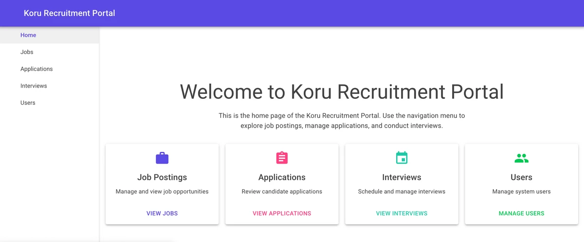
Before (MudBlazor):

After (Tailwind CSS):
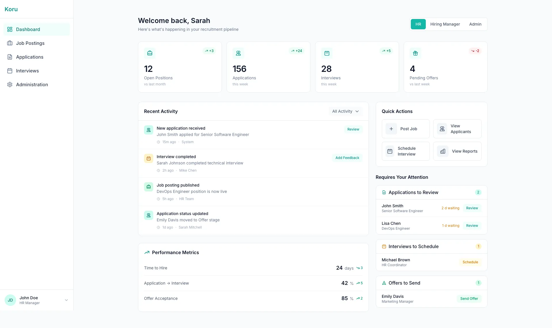
The homepage transformation is dramatic. The MudBlazor version had four static feature cards in a 2x2 grid — functional but uninformative. The Tailwind version introduces a proper dashboard with live metrics (Open Positions, Applications, Interviews, Pending Offers), change indicators (+3, +24, +5, -2), an activity feed, quick actions, and a “Requires Your Attention” panel. The teal brand color replaces Material Design purple throughout.
Job Listings: Dense Cards → Clean Modern Cards
Before (MudBlazor):
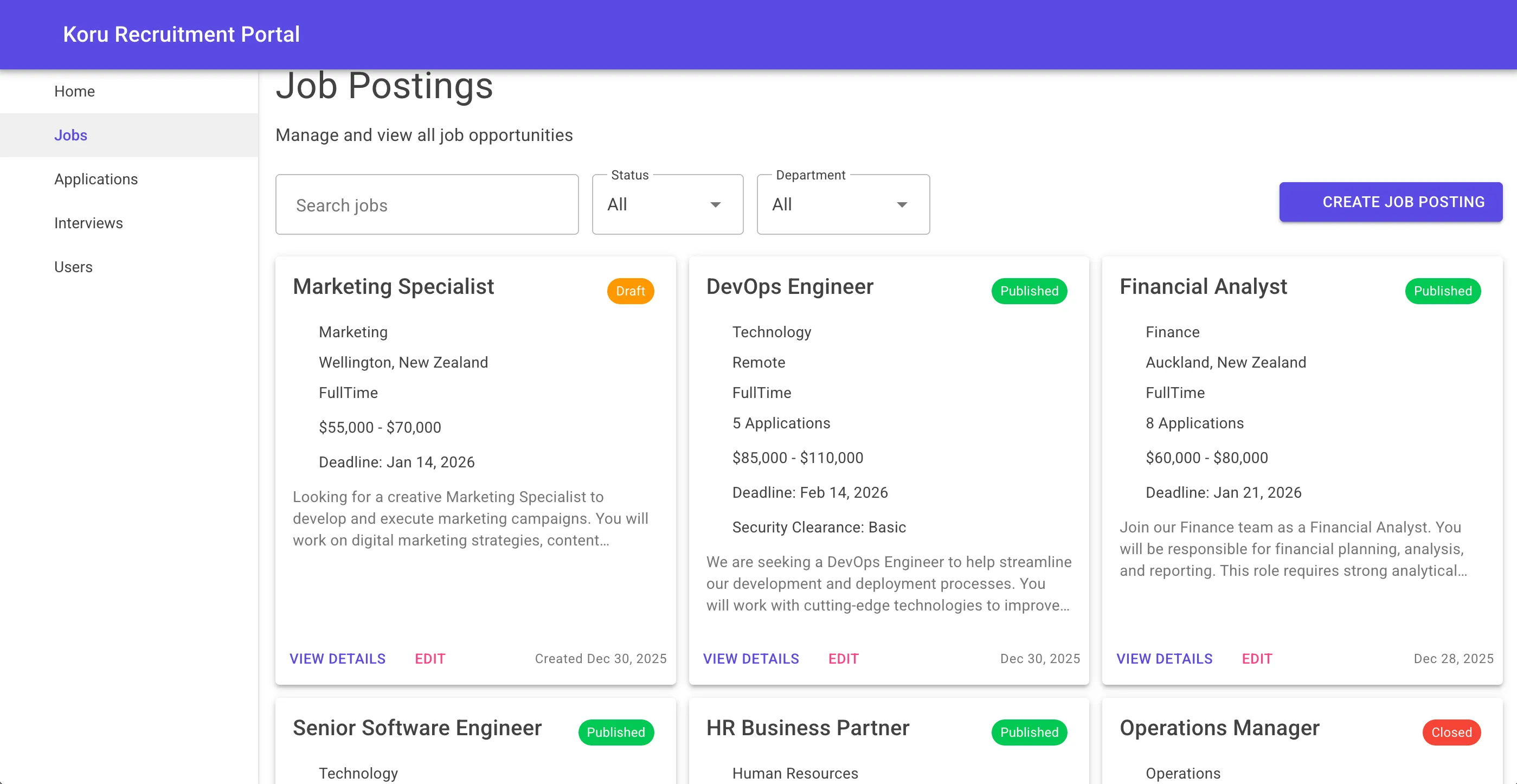
After (Tailwind CSS):
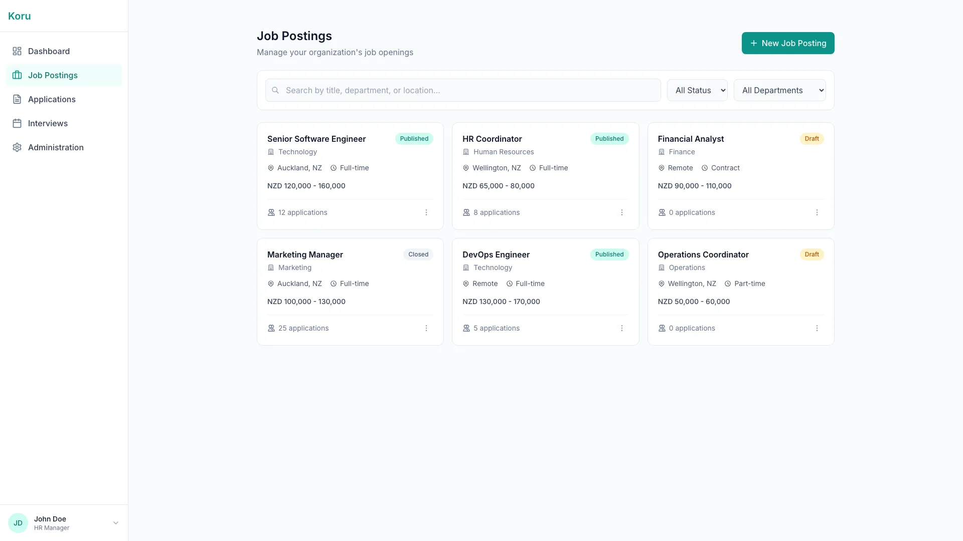
The jobs page evolution shows the styling philosophy shift. MudBlazor cards had Material elevation shadows and dense information display. The Tailwind cards use subtle borders with hover effects, cleaner typography, and better visual hierarchy. The “CREATE JOB POSTING” button in purple becomes ”+ New Job Posting” in teal — more inviting, less commanding.
Applications: Data Grid → Refined Table
Before (MudBlazor):
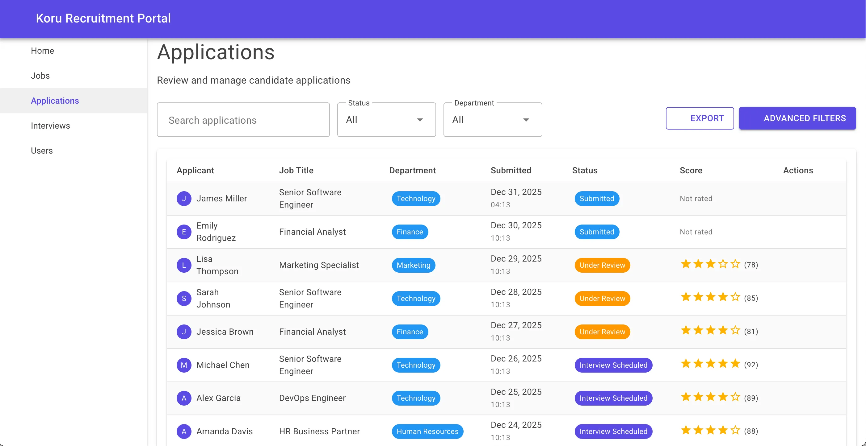
After (Tailwind CSS):
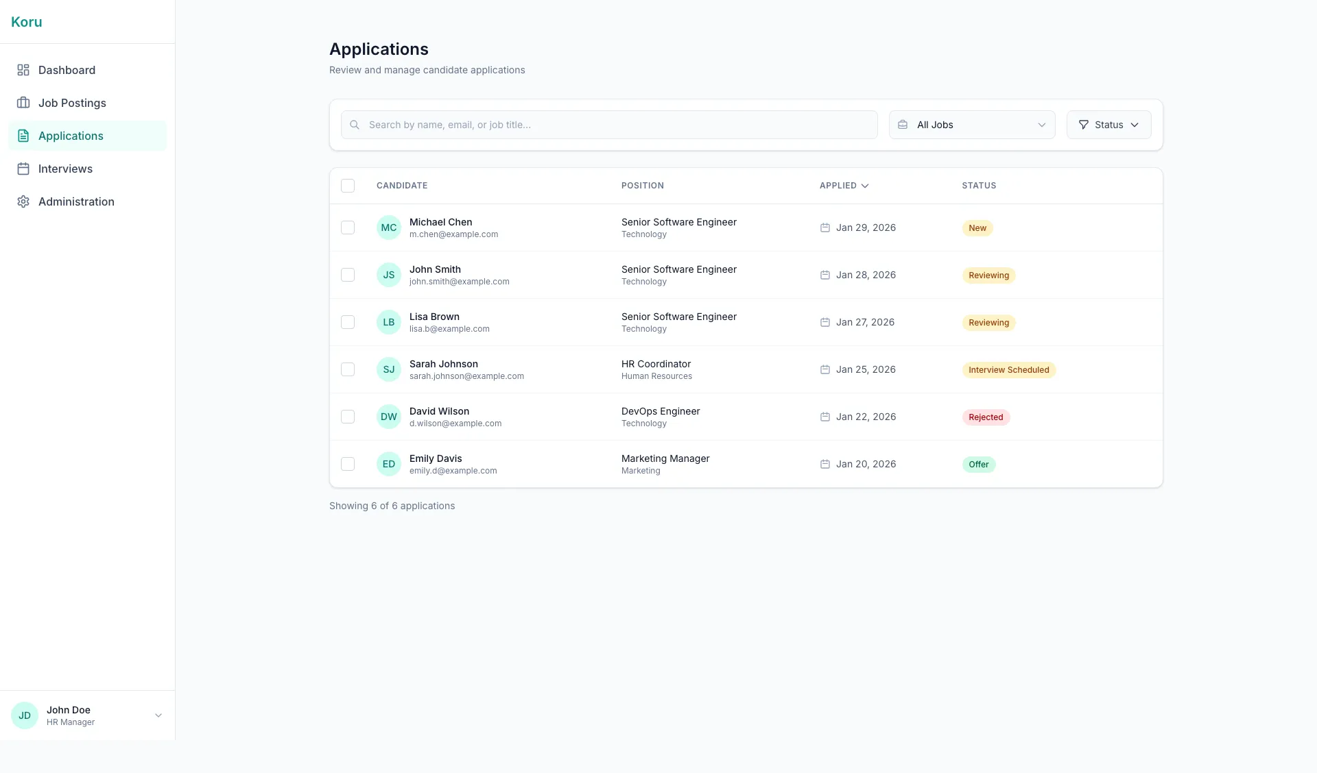
The applications view maintains tabular data presentation but with improved status badges, cleaner row styling, and consistent dark mode support. The colored department badges use semantic colors that carry meaning throughout the application.
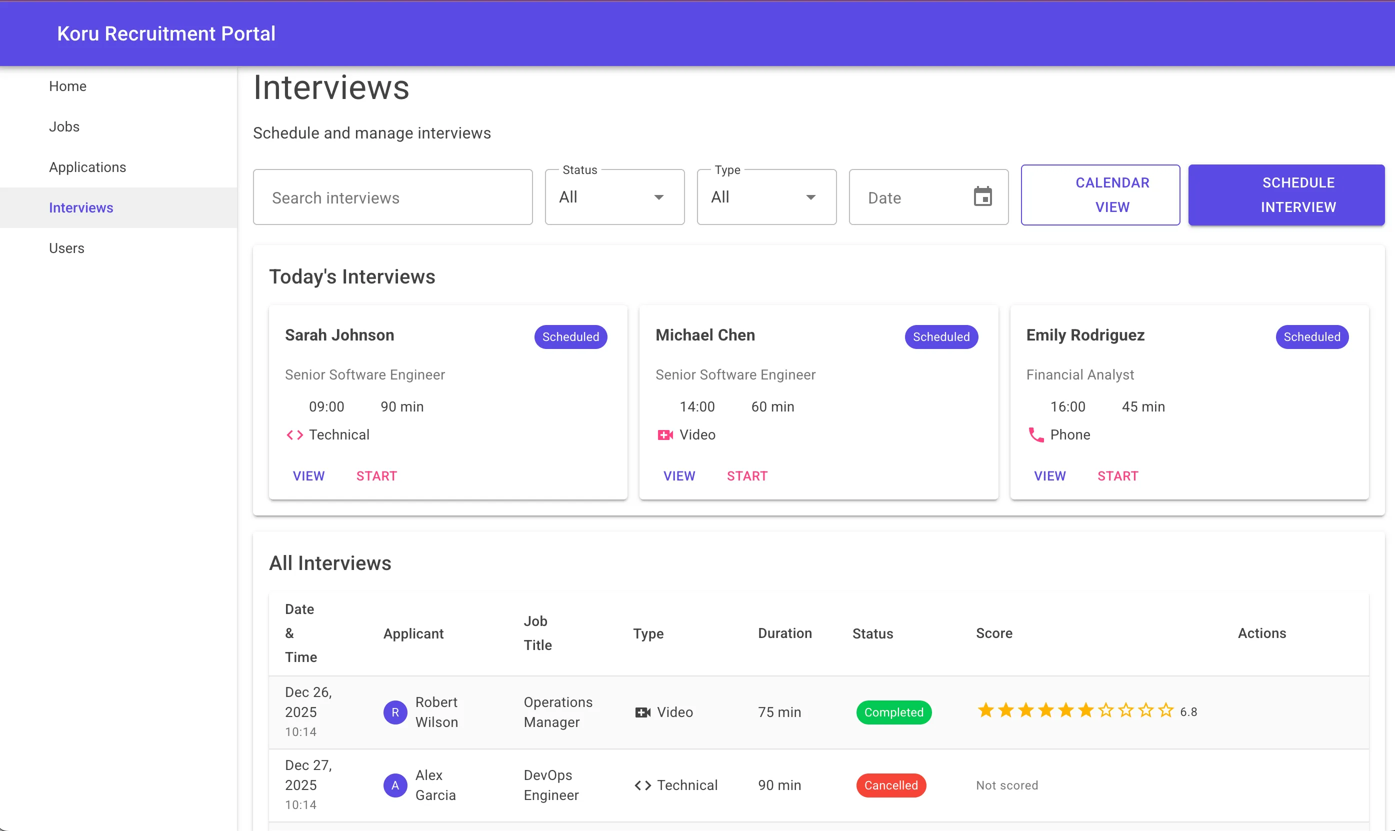
Interviews: Calendar & Cards Integration
Before (MudBlazor):
After (Tailwind CSS):
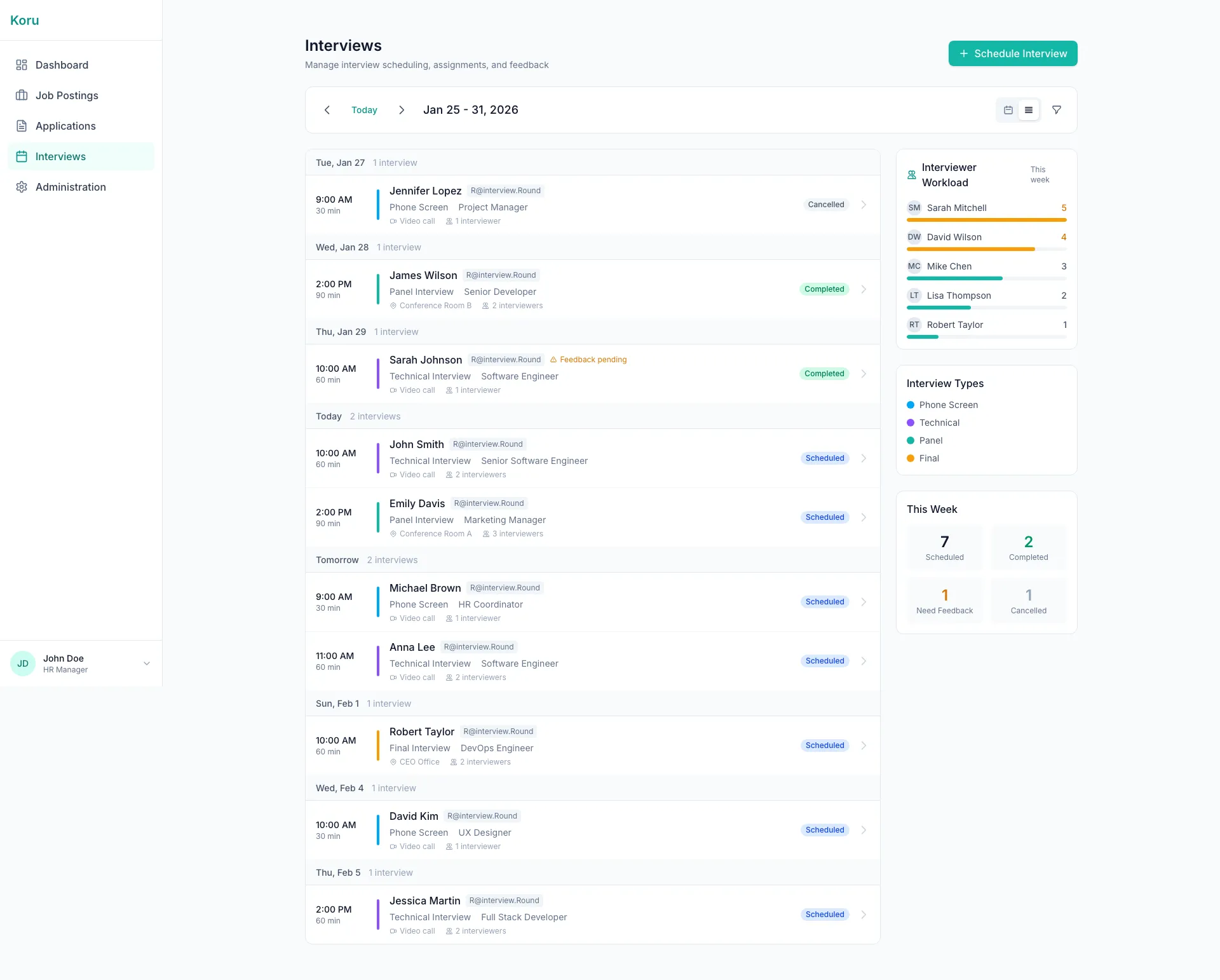
The interviews page shows the most dramatic UX improvement. The MudBlazor version listed “Today’s Interviews” cards above a data table. The Tailwind version introduces a proper calendar grid view, interviewer workload visualization, interview type breakdown, and weekly statistics. It transformed from a list into an actual scheduling tool.
Summarizing the key differences, the MudBlazor version featured:
- Purple primary color following Material Design conventions
- Roboto typography — recognizable but generic
- Elevation-based shadows on cards
- UPPERCASE action links (“VIEW JOBS”, “VIEW APPLICATIONS”)
- Fixed sidebar that did not adapt to mobile screens
- Material Design icons via the MudBlazor icon library
The Tailwind version introduced:
- Teal brand color (#0d9488) establishing a unique identity
- Inter typography — modern, clean, highly legible
- Border-based cards with subtle shadows on hover
- Sentence-case text for a friendlier tone
- Responsive sidebar with hamburger menu on mobile
- Inline SVG icons with no external dependencies
The color philosophy shifted from “Material Design defaults” to “semantic intention.” Teal for primary actions and branding. Amber for save/favorite functionality. Emerald for success states. Red for destructive actions. Every color choice now has meaning.
Developer Experience Changes
Working with Tailwind in Blazor differs significantly from using MudBlazor. The developer experience has trade-offs worth understanding.
Workflow Differences
With MudBlazor, development was component-driven. Need a card? <MudCard>. Need a button? <MudButton>. The API was discoverable through IntelliSense, and the documentation provided clear examples.
With Tailwind, development is class-driven. Building a card means composing utility classes. This requires either memorizing the Tailwind vocabulary or having the documentation open. The initial velocity is slower, but the ceiling is higher — you can build anything without hitting component library limitations.
CSS Organization
MudBlazor abstracts CSS entirely. You rarely write custom styles because the components handle everything.
Tailwind shifts CSS into your markup. Some developers find this cluttered; I found it clarifying. The styles are right there with the HTML structure. No hunting through stylesheets to understand why something looks the way it does.
For shared patterns, I created component CSS strings in code blocks:
@code {
    private const string CardClass = "bg-white dark:bg-slate-800 rounded-xl " +
                                     "border border-slate-200 dark:border-slate-700 p-6";
    private const string ButtonClass = "px-4 py-2 bg-teal-600 hover:bg-teal-700 " +
                                       "text-white font-medium rounded-lg transition-colors";
}
Tooling Considerations
MudBlazor has excellent Visual Studio integration. Tailwind’s tooling ecosystem is broader but less Blazor-specific. The Tailwind CSS IntelliSense extension for VS Code provides autocomplete for class names, but the experience in full Visual Studio varies.
The build process requires Tailwind CLI to compile and purge CSS. This adds a step to the development workflow but ensures production CSS is minimal.
Performance Impact
While I do not have precise measurements from production, the theoretical performance profile improved:
CSS Bundle Size: Tailwind’s purging eliminates unused classes. With MudBlazor, you ship the entire component library’s CSS even if you use only a subset of components.
JavaScript Payload: MudBlazor includes JavaScript for ripple effects, dialogs, popovers, and other interactive components. The Tailwind version uses CSS transitions and minimal JS only where necessary (like the mobile menu toggle).
Initial Load: Blazor WebAssembly applications already have significant initial payloads (.NET runtime, assemblies). Reducing the CSS/JS overhead helps mitigate this.
The trade-off is increased HTML size due to utility classes in the markup. In practice, this is negligible compared to the CSS savings, and the HTML compresses well with gzip.
Challenges and Solutions
The migration was not without difficulties. Several patterns required creative solutions.
Dark Mode Coordination
The challenge with dark mode was ensuring every component respected the theme. With Tailwind, this meant adding dark: variants to every element that had color. Missing even one created visual inconsistency.
The solution was systematic: I established a checklist of properties that needed dark variants (background, text, border, ring) and reviewed every component against it. The explicitness, while verbose, eliminated surprises.
Form Input Styling
Blazor’s InputText, InputSelect, and other form components do not accept class parameters by default in some configurations. Styling required either wrapper divs or CSS targeting the generated elements.
I used wrapper divs with absolute positioning for icons:
<div class="relative">
    <svg class="absolute left-3 top-1/2 -translate-y-1/2 w-5 h-5 text-slate-400">...</svg>
    <InputText class="w-full pl-10 pr-4 py-3 ..." />
</div>
This pattern proved flexible and worked consistently across all input types.
Icon Migration
MudBlazor provides Material Design icons through a simple API: Icon="@Icons.Material.Filled.Work". Without this, every icon needed to be sourced and embedded as inline SVG.
I created a library of icon components (IconBriefcase.razor, IconCalendar.razor, etc.) that accept a Class parameter for sizing:
<!-- IconBriefcase.razor -->
<svg class="@Class" fill="none" stroke="currentColor" viewBox="0 0 24 24" xmlns="http://www.w3.org/2000/svg">
    <path stroke-linecap="round" stroke-linejoin="round" stroke-width="2" d="M21 13.255A23.931..."/>
</svg>

@code {
    [Parameter] public string Class { get; set; } = "w-5 h-5";
}
This approach eliminated external icon library dependencies and provided full control over icon styling.
Complex Components
Some MudBlazor components have no direct Tailwind equivalent. Data tables, date pickers, and autocomplete inputs required either finding third-party alternatives or building simplified custom implementations.
For this project, I prioritized the most impactful components and accepted simpler alternatives where full feature parity was not critical. A recruitment platform needs good forms and cards more than it needs a 50-feature data grid.
Lessons Learned
After completing the migration, several insights stood out.
What went well:
- The design freedom was liberating. Every pixel was intentional.
- Dark mode implementation was more predictable with explicit variants.
- Responsive design felt natural with mobile-first utilities.
- The final CSS bundle was substantially smaller.
- Team members found the Tailwind approach easier to understand — styles were visible in the markup.
What was harder than expected:
- Building component equivalents for complex MudBlazor features took time.
- Maintaining consistency across many components required discipline.
- The initial learning curve for Tailwind’s class vocabulary was steeper than anticipated.
- Some IDE tooling worked better than others.
Best practices discovered:
- Establish color semantics early and document them.
- Create reusable class string constants for common patterns.
- Use C# code blocks for complex conditional styling.
- Build an icon component library early in the process.
- Test dark mode continuously, not as an afterthought.
What I would do differently:
- Start with Tailwind from the beginning for projects requiring custom branding.
- Create a living style guide document with class pattern examples.
- Invest more time in tooling setup before starting migration.
Recommendations
Having completed this migration, I have clearer perspective on when each approach makes sense.
Choose MudBlazor when:
- Rapid prototyping is the priority
- Material Design aesthetic aligns with your brand
- The team is less experienced with CSS
- Built-in components cover 90%+ of your needs
- Time-to-market outweighs design flexibility
Choose Tailwind CSS when:
- Custom branding is important
- Dark mode is a requirement
- Mobile-first responsive design is critical
- You want full control over the visual layer
- Long-term maintainability matters more than initial velocity
- The team is comfortable with CSS concepts
Prerequisites for a successful migration:
- Solid understanding of CSS fundamentals (Tailwind is CSS, not an abstraction)
- Time to invest in learning Tailwind’s utility vocabulary
- Willingness to build or source replacements for complex components
- A design direction or brand guidelines to implement
Conclusion
Migrating Koru Recruitment from MudBlazor to Tailwind CSS was a significant undertaking, but the result justified the effort. The application now has a distinctive visual identity, robust dark mode support, truly responsive layouts, and a leaner CSS payload.
The migration reinforced an important lesson: the right tool depends on the context. MudBlazor remains an excellent choice for many Blazor projects. But for applications that need to break free from Material Design conventions and establish a unique brand presence, Tailwind CSS offers a compelling path forward.
The platform is now live and serving its purpose. Users get a clean, responsive interface that works on any device. The government client has a recruitment tool that feels custom-built rather than template-driven. And I have a codebase where every visual decision is explicit, documented in the classes themselves.
If you are considering a similar migration, start small. Convert one page, experience the workflow differences, and decide if the trade-offs make sense for your project. The investment is real, but for the right use case, the return is substantial.
Explore the results:
Have questions about migrating your Blazor application to Tailwind CSS? I am happy to share more details about specific patterns or challenges. Reach out anytime.